Qwen-Image 2.1 text rendering: it spells almost everything, then makes up the fine print
I tested Qwen-Image 2.1 text rendering on menus, phone screens, covers, charts and pages. The spelling holds up. The fine print and the layout often don't.
Alex Lew · Sep 24, 2026 · 11 min read
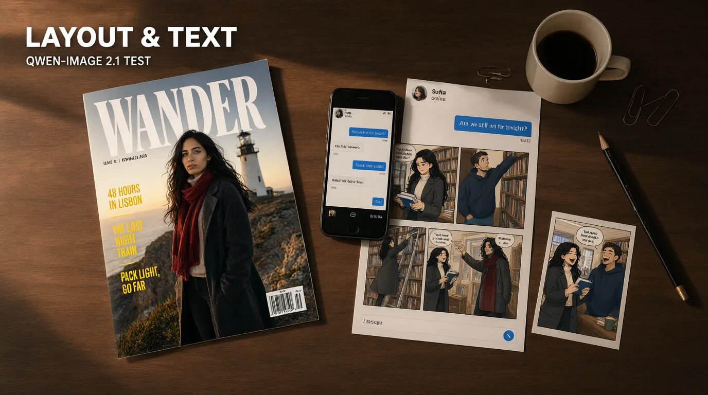
Qwen-Image 2.1 came out in mid-September, and the release made a point of its typography. I had already run it through a set of pages for another write-up, and it lettered a twelve-panel page without a single typo. That is why I came back. A speech balloon holds five or six words, though. The things people actually need words on are menus with prices, app screens, magazine covers, charts, and notices with a whole paragraph of small type. So this round is only about Qwen-Image 2.1 text rendering, on exactly that kind of work.
I wrote 13 prompts from scratch and ran each one on two fixed seeds, 8701 and 8702, at default settings and about one megapixel: 3:4 for the pages, the cover, the poster and the notices, 4:3 for the menu, the character sheet and the chart, and 9:16 for the phone screen. Then I edited four of those pictures with the same model, two seeds each, and made this post's cover the same way. That comes to 38 renders. Every line of text was written into the prompt word for word, and I checked each render at full size, zoomed in, line by line. The seconds in each caption are how long that image took in my runs.
Wherever there are people, it's the same three made-up adults, all in their late twenties and described in words every time. Mara has long black hair, green eyes and a charcoal coat. Kai has short dark hair, stubble and a navy hoodie. Sofia has a copper bob, freckles and a mustard cardigan.
22 of the 26 fresh renders spelled every word I asked for. Only 16 did it without also adding text I never asked for. And the picture around the words followed the prompt less often than the words did.
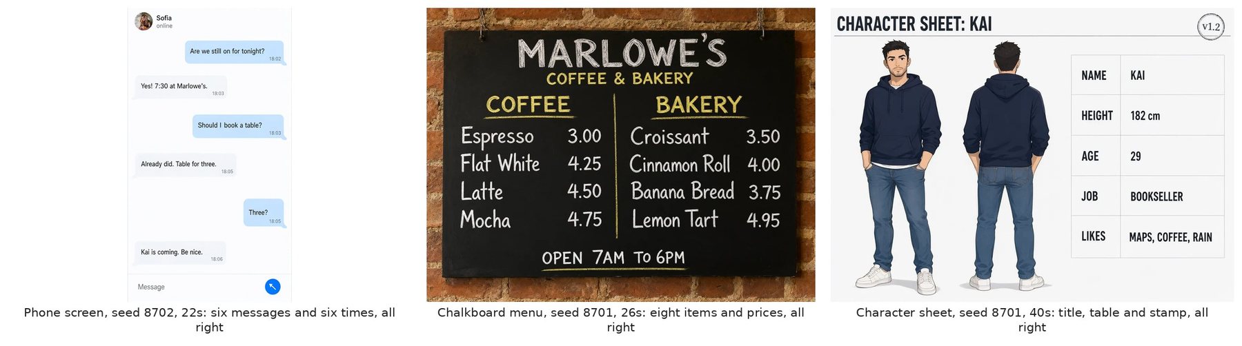
Flat designs come out clean
The phone screen, the chalkboard menu and the character sheet were right on both seeds, all six renders. The chat has six bubbles on alternating sides, each with its own time under it, and every word and every time matched. The menu lists eight items in two columns with the prices right-aligned, which is a layout instruction as much as a spelling one. Both seeds did it. The character sheet got its title, a five-row table (name, height, age, job, likes) and a small "v1.2" stamp in the corner.
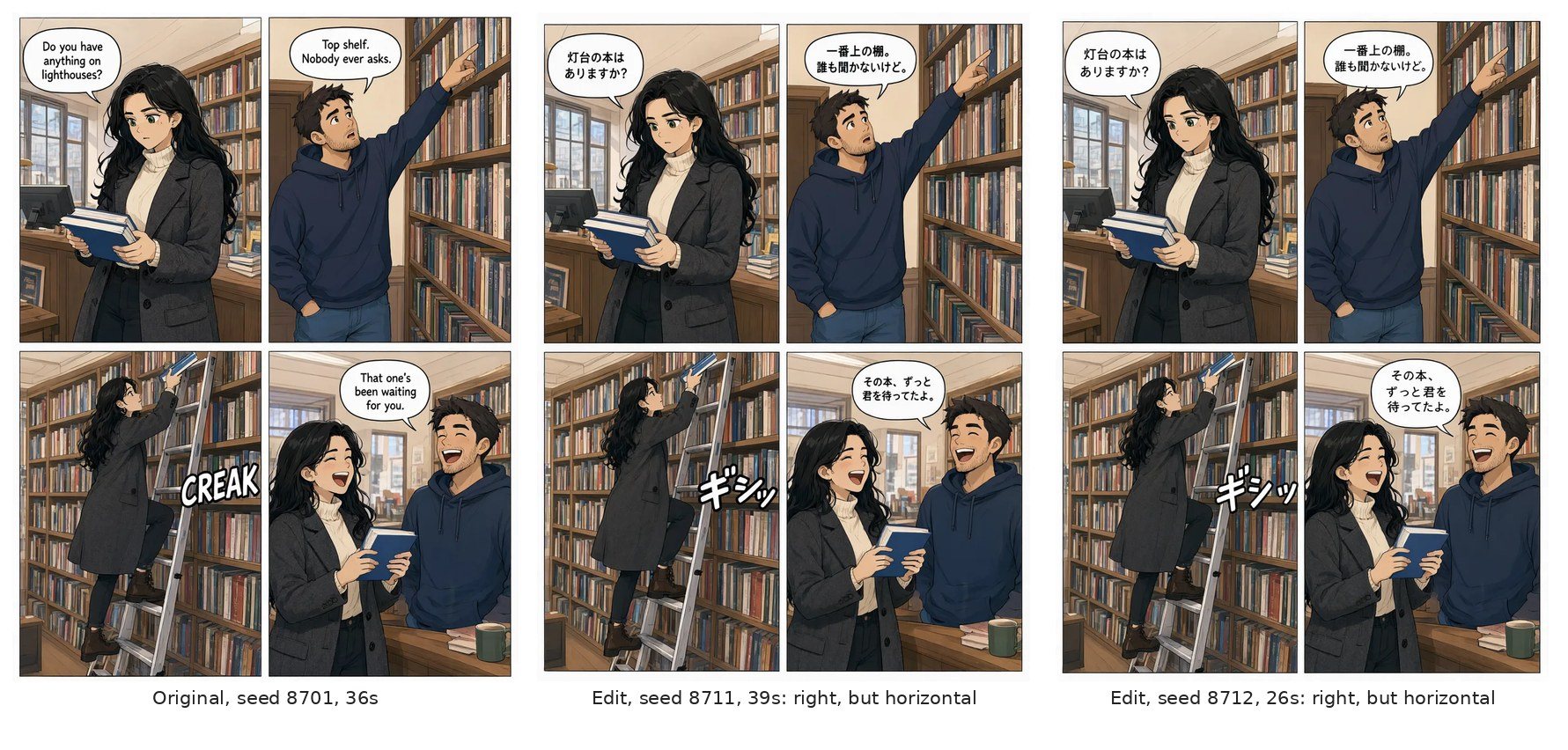
The four-panel page belongs here too. Three balloons and a CREAK sound effect, all spelled right and in the right panels, on both seeds.
A long notice breaks in one place, not at the end
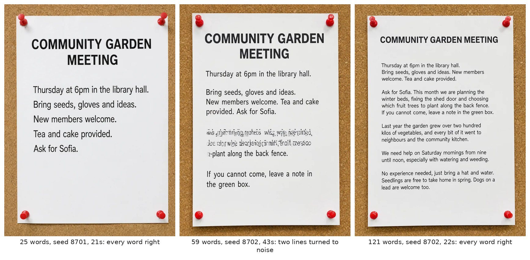
I built this test to find the word count where it gives up. It's a printed notice for a community garden meeting, pinned to a cork board, at 25, 59 and 121 words including the headline. The layout stays the same and only the body text grows.
There was no cliff. At 25 words, both seeds printed every word. At 59, seed 8701 was perfect, and seed 8702 turned two lines in the middle, about 18 words, into letter-shaped noise, with clean lines above and below them. At 121 words, seed 8702 printed every single word and seed 8701 got about four wrong.
So length didn't decide it. One line goes bad while the rest of the notice stays fine, and that happened at 59 words as readily as at 121. At every length, one of the two seeds came out clean. Two seeds per length is far too few to call that a rate, but it's why I'd render at least two of anything with a paragraph on it.
It invents the small print
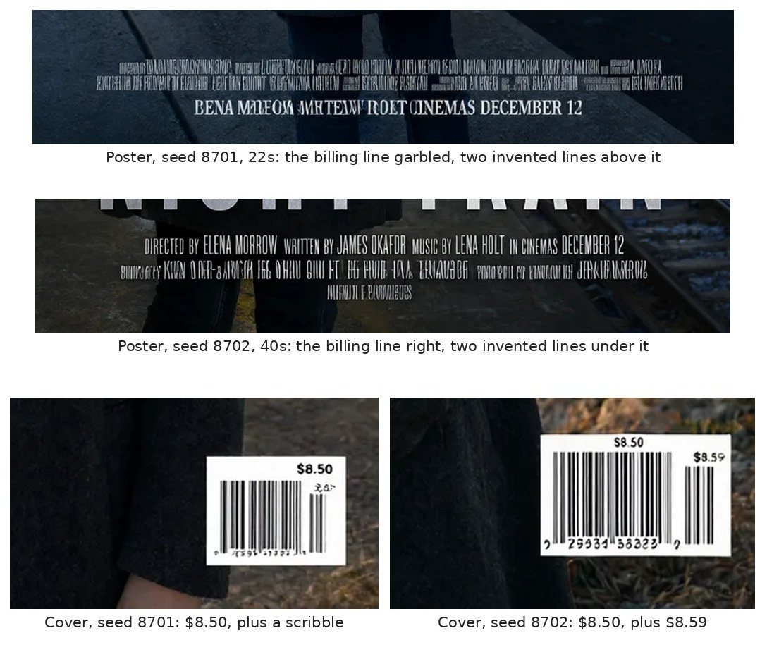
This was the most consistent habit in the whole set. Wherever a real design of that kind would carry small print, it adds some, and the added text is never real words.
- The movie poster asked for one billing line at the bottom: director, writer, composer and release date. Seed 8701 garbled that line into "BENA MALFOM MHTEAW ROET CINEMAS DECEMBER 12" and added two rows of fake credits above it. Seed 8702 printed my billing line perfectly, then added two rows of fake credits under it. Writing out the exact line didn't stop the extras.
- The magazine cover asked for a barcode box with the price "$8.50". Both seeds printed $8.50, and both added a second price next to the barcode, "$8.59" on one and an unreadable scribble on the other.
- On the six-panel page, one seed put a garbled little label above a text message, and the other hung a sign over the station platform that reads as nothing.
- Seed 8702 of the twelve-panel page grew an extra speech balloon full of mirrored nonsense.
None of this touches the text you asked for, which is exactly why it's easy to miss. Look at the corners, the credits, any barcode and anything in the background before you use a render.
The words land, the picture wanders
On the story pages the text was nearly perfect and the staging was not.
Panel one of the six-panel page asks for Sofia under an umbrella on a rainy street. Panel two is a text from Mara: "Running late. Save me a seat?" Both seeds drew Mara under the umbrella with Sofia in panel one, a panel before she texts to say she's late. My guess is that it read the cast list at the top of the prompt as "draw both of these", but I didn't test that.
The twelve-panel page shows it better. Seed 8701 drew all twelve panels and spelled all twelve lettered beats right, and still gave three of Mara's lines to Sofia ("Step one: do not panic", "That was step two" and "It's a tree kite now"). It also had Mara open the box in panel one, which was Kai's job. Seed 8702 drew thirteen panels, with four in the second row, put two copies of Kai in panel two and moved the SNAP! out of order.
Smaller layout asks got dropped the same way. The cover prompt wanted her head to overlap the bottom of the masthead, a very magazine thing to do, and neither seed did it. The poster asked for Mara seen from behind, and seed 8702 turned her to face the camera.
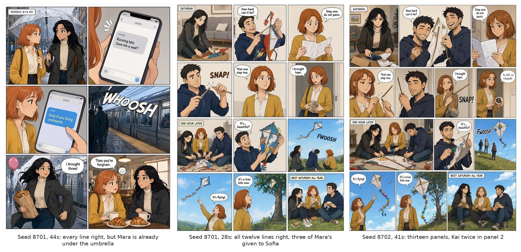
I didn't find a prompt fix for the swapped speakers in this round. For now, the only fix I have is reading every balloon against the script.
The chart has the right labels and the wrong bars
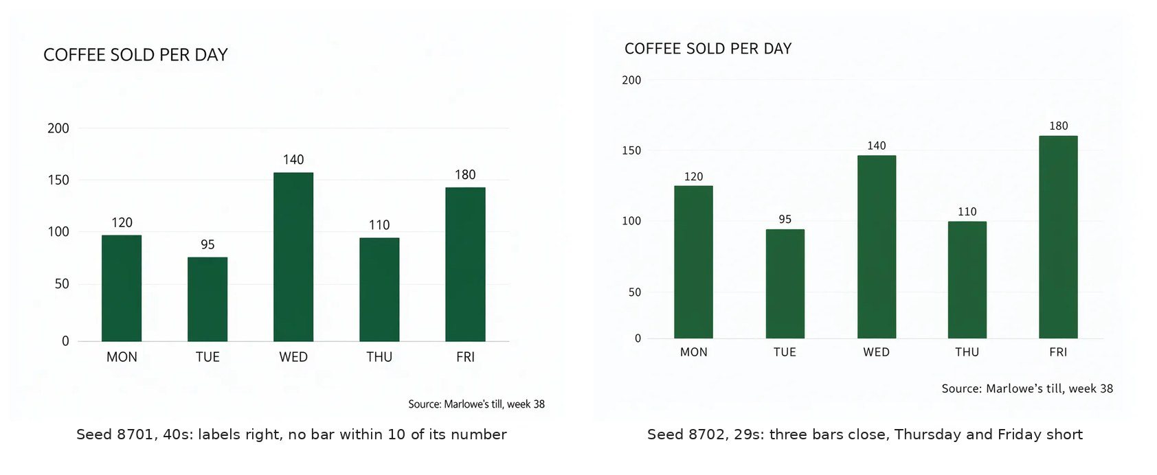
The bar chart is the clearest case of text and picture going separate ways. I asked for five bars, Monday to Friday, at 120, 95, 140, 110 and 180, on an axis from 0 to 200. Every label, value and axis number came out right on both seeds, footnote included. The bars didn't. I measured them in pixels against each chart's own axis.
- Seed 8701: not one bar within 10 of its number. Friday, labelled 180, stands at about 142, which is shorter than Wednesday.
- Seed 8702: the order is right, and Monday, Tuesday and Wednesday land within 6. Thursday comes in at about 100 and Friday at about 160. The axis itself is uneven, with the step from 0 to 50 about two thirds the height of the others.
It prints the numbers as text and draws the bars as decoration. If the heights matter, make the chart in a spreadsheet.
Japanese, set vertically
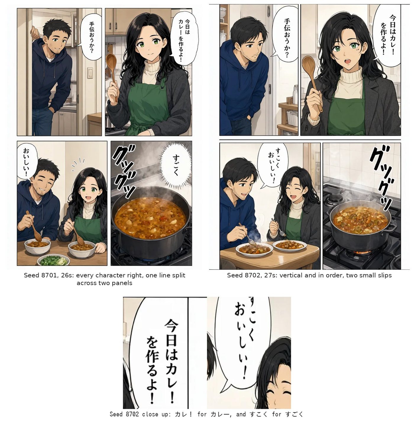
One page was all Japanese: four panels read right to left, with the lettering set vertically in the balloons, the way manga is lettered. Both seeds got the direction and the reading order right.
Seed 8701 got every character right but split one balloon in two. 「すごくおいしい!」 became すごく in a burst over the pot and おいしい! in the next panel. Seed 8702 kept each line in its own balloon and made two small slips: カレー lost its long vowel mark and became カレ!, and すごく lost its voicing mark and became すこく. That second slip is the same word and the same missing mark I got in my earlier round.
I left the sound effect out of the count. グツグツ came out close enough that I couldn't call it either way.
Changing the words in a picture you already have
The same model edits too. You give it a picture and tell it what to change. I tried four text edits, each on two seeds.
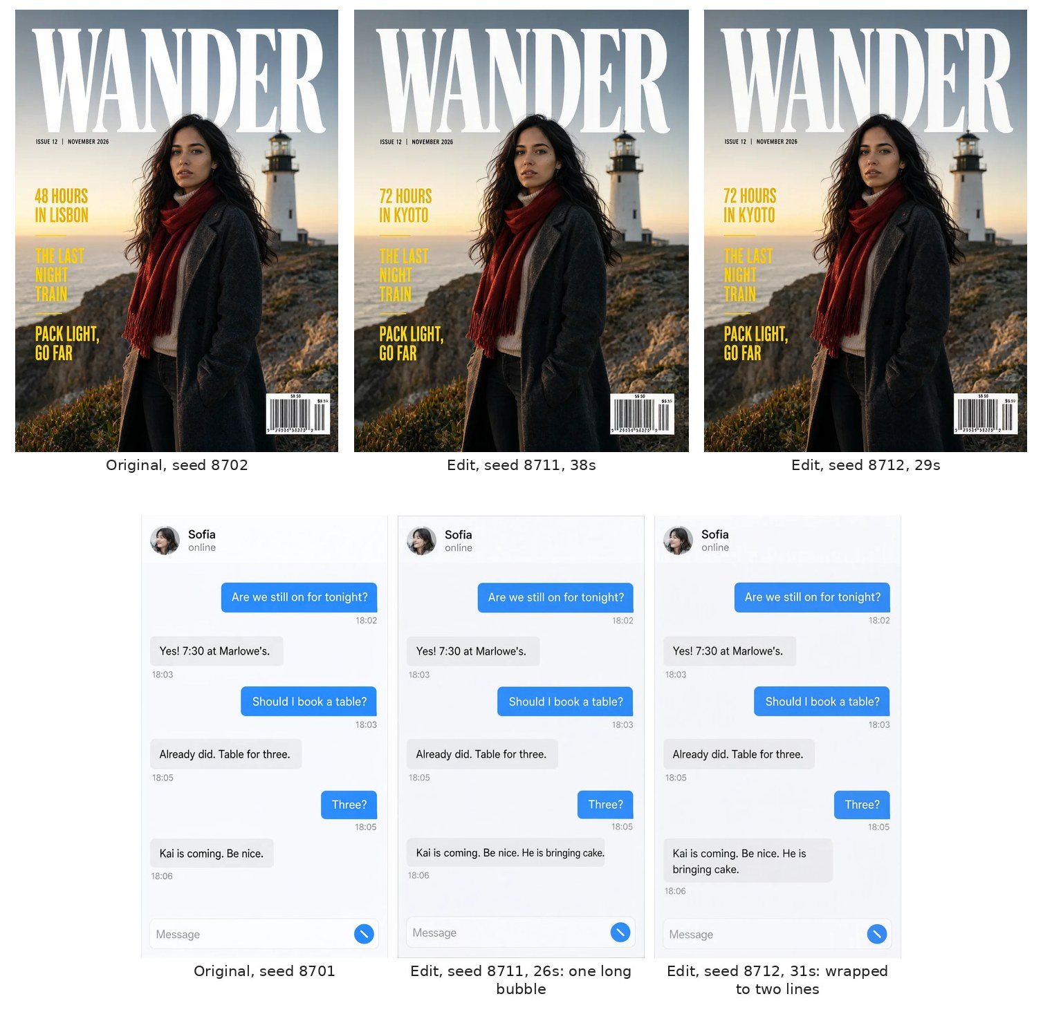
- Cover: "48 HOURS IN LISBON" to "72 HOURS IN KYOTO". Right on both seeds, in the same yellow type in the same spot, and nothing else moved. The barcode kept its fake second price.
- Phone screen: add "He is bringing cake." to the last message. Right on both. One seed widened the bubble to fit and the other wrapped it onto two lines. Every other bubble and time stayed put.
- Four-panel page: replace the English with Japanese, set vertically. Every character came out right on both seeds and the drawings didn't change, but both kept the lettering horizontal. Drawing from scratch, it set Japanese vertically on both seeds. Editing a horizontal page, it stayed horizontal.
- Menu: change the Latte from 4.50 to 5.25. This one failed on both seeds. The Latte stayed at 4.50. Seed 8711 changed the Cinnamon Roll to 5.25 and the Mocha to 5.75, and seed 8712 changed only the Cinnamon Roll.
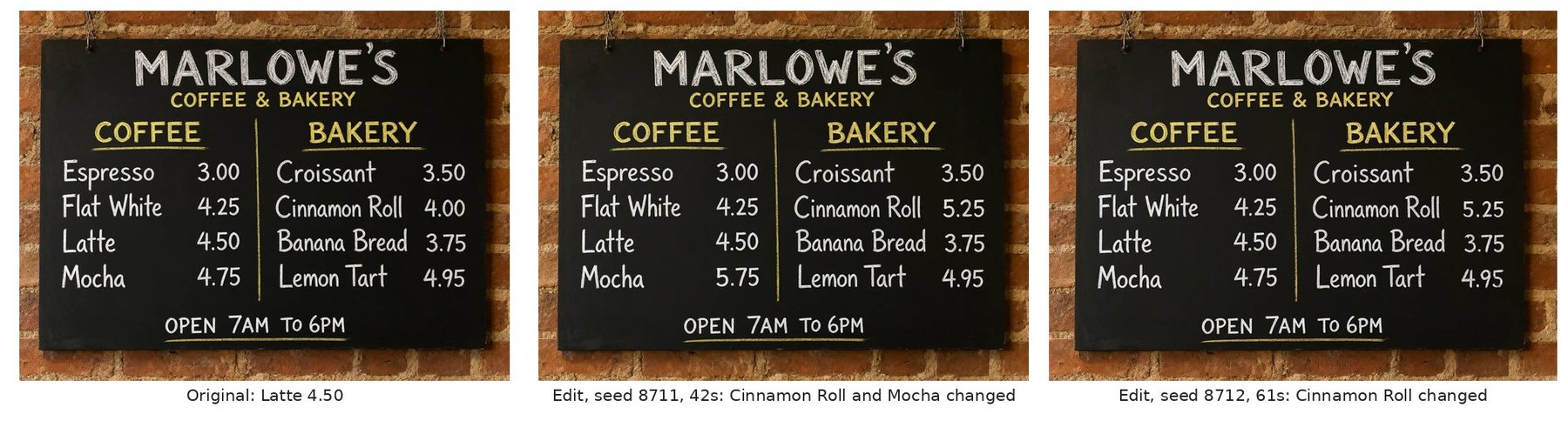
My guess on the menu is that a column of short prices that all look alike gives it nothing to pin "the Latte" to. I didn't test that either. After any edit on a list of numbers, check every number, not just the one you asked about.
The cover of this post
I made the cover with the same edit mode. It got four of the test renders as references, each one referred to by its index in the prompt: the magazine cover, the phone screen, the four-panel page and the menu. Two prompts, a desk and a cork board, on two seeds each. The title, LAYOUT & TEXT, came out right on all four. Keeping the four pictures was harder. One desk render kept all of them. The one I used dropped the menu and pasted the top of the phone screen onto the comic page. Both cork board renders lost at least one picture, and one of them misspelled the first cover line as "48 HIURS". On both desk renders, the small print on the phone and the page turned to mush.
What I'd use it for
- Phone screens, menus, tables and short notices. Use it, then read every line at full size.
- Anything with a paragraph on it. Render at least two seeds and keep the clean one.
- Posters and covers. Expect fake fine print.
- Story pages. The lettering will probably be right, so spend your checking time on who is saying it.
- Charts. Not for data.
- Edits. Fine on one distinctive line, risky on a list of numbers that look alike.
Every render
| Test | Seed 8701 | Seed 8702 |
|---|---|---|
| Four-panel page | all right | all right |
| Six-panel page | text right, stray label, Mara in the wrong panel | text right, nonsense sign, Mara in the wrong panel |
| Twelve-panel page | text right, three lines to the wrong speaker | text right, 13 panels, a nonsense balloon |
| Japanese page | all right, one line split | two slips |
| Magazine cover | text right, extra price | text right, extra price |
| Phone screen | all right | all right |
| Character sheet | all right | all right |
| Chalkboard menu | all right | all right |
| Movie poster | billing line garbled, fake credits | billing line right, fake credits |
| Bar chart | text right, bars wrong | text right, two bars short |
| Notice, 25 words | all right | all right |
| Notice, 59 words | all right | two lines garbled |
| Notice, 121 words | about four words wrong | all right |
| Edit | Seed 8711 | Seed 8712 |
|---|---|---|
| Cover line | right | right |
| Chat message | right | right |
| English to Japanese | right, but horizontal | right, but horizontal |
| Latte price | two wrong prices changed | one wrong price changed |
If you want to try your own prompts without installing anything, there's a free image generator right here on nsfwaifans.
Sponsored
Make your own in a minute
Text, photo or video, all in one place.