How to pay safely on an adult AI site
Generic advice says walk away from a strange checkout. In this niche that rules out almost every site. We walked 25 of them. Here is what to check instead, and when to actually stop.
nsfwaifans · Sep 6, 2026 · 13 min read
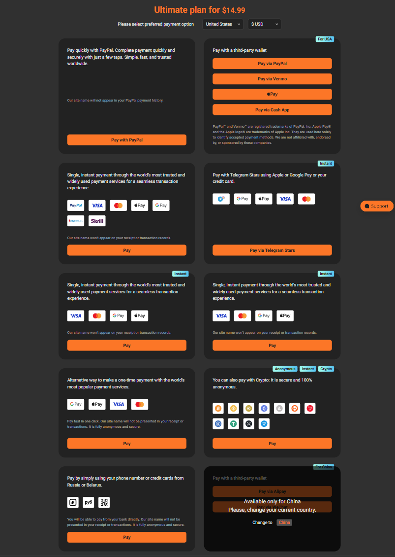
You pressed the subscribe button expecting a card form. What opened was a grid of ten payment panels, two of them labelled in a language you do not read, and nowhere on any of them to type a card number. Pick one and it starts a countdown.
You are right to stop. You are about to spend between three and fifteen dollars on a site you found this afternoon, and nothing here looks like a shop. The trouble is that the usual advice for this moment, if the checkout looks strange then walk away, does not work in this category. We walked 25 of these sites in August 2026. A strange checkout is not the exception here, it is the baseline, and following that advice means leaving all of them, the good ones included.
So this piece does two other things. It tells you what to check before you reach a checkout, because by then the decision is mostly made. And it gives you the one distinction that still works at the payment screen: not strange against normal, but automated against improvised.
Why they all look like this
Card networks price adult merchants as high risk. A checkout here is therefore not a design decision, it is whatever set of providers agreed to process the money, and each panel in the grid is a different one, wired in because it settles somewhere the others do not. When we walked one checkout end to end, as a US buyer on desktop, the button opened ten panels and not one of them was a card form. The site's bundle carries thirteen of these providers in total; the other three do not render for a US buyer at all. Every panel filed under that site's own card tab ended somewhere else.
A purchase here passes through three parties as a rule: the company selling you the plan, the checkout service rendering the page, and the licensed acquirer that actually moves the money. The name on your bank statement is usually the third one, so it will not match the site.
An unfamiliar statement name is therefore evidence of nothing here, and the order confirmation is worth keeping: it is the one place the site's name and the processor's name appear together.
If you want the long version of one checkout, panel by panel, we published that walkthrough separately: how to pay for PornWorks AI without ending up in a crypto wallet.
The diligence has to happen before you sign up
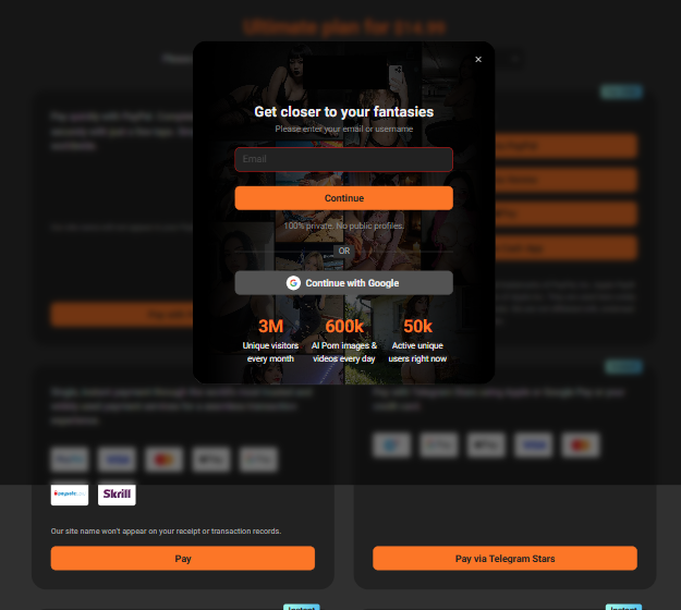
We tried to reach a payment page as an anonymous visitor on all 25 sites. On 15 of the 25 the plan button raises a signup or login wall, with no route to a payment form without an account first. On 2 the payment surface was reachable without an account, and one of those two is our own site. On the remaining 8 we did not walk past the plan page, so we do not know.
That is a sequencing fact, not a complaint. By the time you can see how you will be asked to pay, you have handed over an email and made an account.
So the checkout is not visible while the decision is being made, and it cannot be the thing you check. Your diligence has to happen while you are still anonymous, and the pages that render without an account are all about the operator.
So check the operator, not the checkout
Four checks. All work logged out, and together they take about two minutes.
The footer and the terms
Look for a company name with a registration number. Across the 24 partner sites we walked, excluding our own, 7 name a real operating company, and several give a registration number that is free to look up in a public company register. That lookup is the check: a name with a number that resolves is a different sort of claim from a name on its own.

The community link, if there is one
An invite preview shows the member count without you joining anything, and the community's own id encodes the date it was created. Across our set the communities run from 711 to 104,128 members, created between February 2022 and November 2024. Two readings off one preview: how many people are around, and how long the thing has been running.
How deep the legal pages go
Not "is there a terms page", because there always is. The question is what sits beside it: an age statement, a content removal route, a named complaints policy, a transparency report. Across our 25 this ranged from 0 to 12 separate documents.
Whether anyone outside the site has ever written about it
Ten seconds of searching. Either there is independent writing about it or there is not.
The part that surprised us
We expected the first two checks to move together, big sites being the ones with real companies behind them. They do not. Of the 24 partner sites:
| count | |
|---|---|
| Names an operating company and runs a public community | 5 |
| Names an operating company, no community | 2 |
| Runs a public community, no findable operating company | 5 |
| Neither | 12 |
The largest community in the set, 104,128 members, belongs to a site where we could not find an operating company name at all. Two others name their operating company in their own legal pages, one of them with a registration number, and run no community whatsoever. They are independent signals, and each buys you something different.
Age and size tell you the site will still be there next month. A named operator tells you there is somebody to answer when it is not. Those are different questions, and a site can pass one and fail the other.
If you have room for one rule, make it the one about what is expensive to acquire.
A three year old site with 90,000 members and an ugly crypto grid is a safer home for your card than a one month old site with a beautiful checkout. A pretty checkout is the cheapest thing on the internet to buy. Three years are not.
One last piece of structure, because it changes what spreading your risk means. Of the 12 sites in that last row, 10 are a single operator running 10 near identical domains off one shared backend, with the same navigation and the same wallet. Buy from three of them in a month rather than putting everything on one site, and you have bought from the same operator three times.
At the checkout, the only thing that really varies is recourse
The language, the layout, the logos and the countdown are cosmetic. What differs between panels is how much of your money you can get back afterwards, and that is set by which rail you land on. Ranked, best first:
| what you land on | who is between you and the site | if it goes wrong |
|---|---|---|
| A hosted card form on a named processor's page | your bank, plus the processor | full chargeback rights, and the processor has its own complaints desk |
| A real wallet checkout (one tap, card backed) | your bank, plus the wallet | wallet dispute process, then your bank |
| A card to stablecoin on-ramp | your bank sees the on-ramp, not the site | you can dispute the on-ramp purchase, but the on-ramp delivered exactly what you bought, so the merchant leg is outside it |
| A chat app credit purchase | the app store or the app's own balance | whatever that platform offers, and it is not a chargeback |
| A gift card code | nobody | none once the code is read |
| A wallet address you paste into | nobody | none |
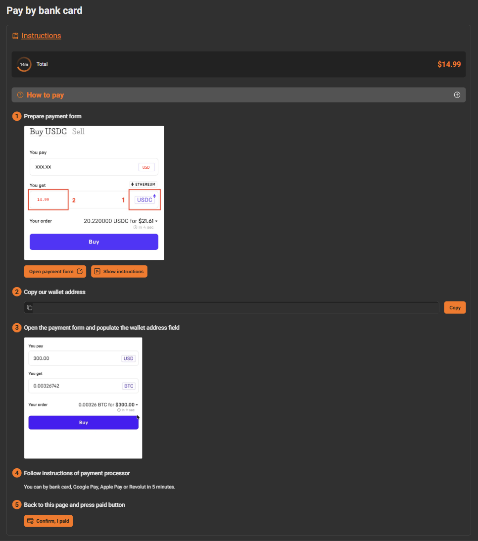
A named processor beats a familiar looking button, because the processor is the only party in that chain with a complaints desk. A panel wearing a well known wallet's name has given you a logo and nothing else: one such panel on the checkout we walked was eight numbered instructions ending in a manual transfer and a button reading "Confirm, I paid", on a 14 minute timer.
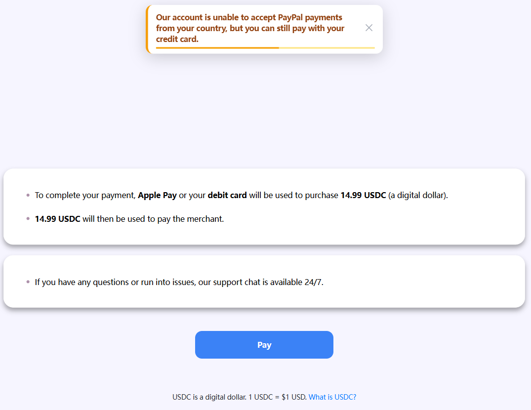
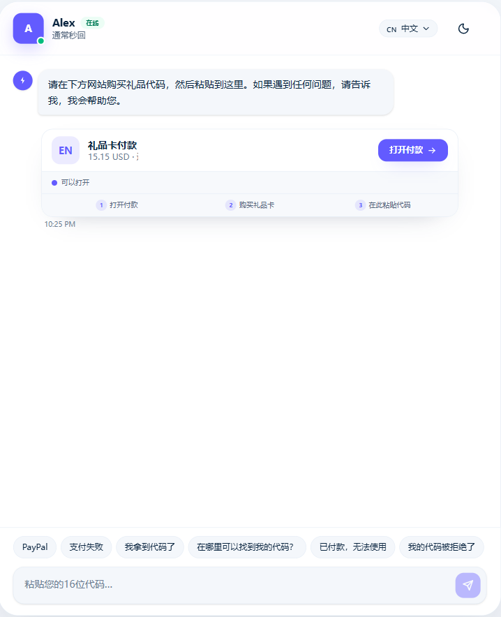
The best route there was a single page that takes a debit card or a phone wallet, buys the exact plan amount in a stablecoin, and pays the merchant with it. One page, no account, no visible ID check, a 27 minute timer. Still an on-ramp, so third in the table, and still the best on offer. That accounts for two of the ten. Two more were third party on-ramps that ask for an email and an ID check before they will sell you the coin. Two ended in a wallet address you copy and send yourself, one of them dressed as a bank card page and one a plain grid of coin logos. One was the live chat further down this page. One needed an account on a chat app and its own currency. The last two were locked to other regions, one to a country's wallet apps and one to another country's bank cards.
Cap the exposure
None of these five needs a judgement call, and all work on any rail.
- Buy the cheapest tier first, even when the annual plan is the obvious value. The annual discount is the largest single exposure you can take on a site you have not used, and every plan page pushes it. Take it second, never first.
- Use a card rather than a bank transfer, and a low limit virtual card number if your bank issues them. The point is not anonymity. It is that a chargeback exists on one and does not on the other.
- Screenshot the order page before you leave it: the amount, the order or reference number, the timer, the destination. On a manual rail that is the only proof a payment belongs to an order.
- Read the refund and cancellation pages before you pay, not after. Thirty seconds, and the highest value thing you can read before handing over money.
- Set a calendar reminder for two days before the first renewal. Where cancellation is self serve it takes a minute. Where it runs through the processor you want time to find the email.
The four alarms that survive
The rule underneath all four is automated against improvised. A flow that is automated, priced, timed and tied to an order number is the norm here, however odd it looks. These four are not.
- A person is telling you what to buy and where to send it. A live chat that sends you to a third shop to buy something and bring back a code is a person improvising, not a payment system.
- An address or a code reaches you outside the site's own checkout, in a chat, an email, a support ticket, a social message. Legitimate flows here are ugly, but they happen inside the checkout the plan button opened.
- The total does not match the plan page and nobody can tell you why. A currency conversion is explainable and is usually shown. An unexplained markup quoted by a person is not.
- A payment page with no order, no quote and no timer. Every automated rail we walked, including the ones ending in a wallet address, ties the payment to an order and puts a deadline on it. A bare address with none of that attached has no way back.
Our clearest example failed two of these at once. One panel on that ten panel grid opened a live chat with a person, who asked the buyer to go and buy a gift card elsewhere and paste the code into the chat. The price quoted there was $15.15 for a $14.99 plan. Worth knowing too: on the cheapest tier, $2.99, several panels grey out under their own minimums, and that chat was the only card branded panel still available.
What is not a red flag
Six things that set off generic advice and should not set off yours.
- The payment page sits on a domain you have never heard of. Almost every checkout in this niche does, because the checkout is a different company from the site.
- There is a crypto step. High risk pricing makes crypto settlement the industry's normal plumbing, not a signal about any one site.
- There is a countdown timer. Every quoted rate has an expiry. The timer is a price lock, not pressure, and letting it run out costs you nothing.
- The page renders in a language you do not read. These stacks are assembled from providers all over the world, and a panel often comes up in its provider's home language.
- Your statement will not say the site's name. It will say the acquirer.
- A licensed on-ramp asks for ID. That is the on-ramp complying with its own money rules, and it is the most regulated thing you will meet all day.
Generic scam advice gets all six of these wrong, and a reader following it bounces off every site in the category, the good ones included.
If it goes wrong
Work in order: the refund page, then cancellation, then a dispute.
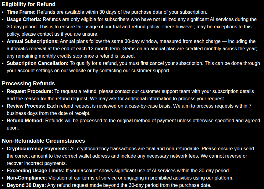
Of our 25 domains, 13 state that all sales are final. Read that number carefully, because those 13 domains are 3 operators, one of which runs 11 of them, so 13 of 25 overstates how much of the market works that way. Three sites publish a time boxed window instead: two allow 24 hours and only if you have spent under a set number of credits, one allows 30 days and only if the account has not made significant use of the service, and that one also states that crypto payments are final regardless. On 8 more we could not find refund terms to read at all, so those are a blank rather than a yes or a no.
On 11 of the 25 you cancel at the billing processor rather than in your account settings. The processor publishes its own support phone number and email, and the cancellation link arrives in the processor's own purchase confirmation email. Save that email, because on a lot of these sites it is the cancellation route.
Then the dispute, which the table above decides. A hosted card form or a real wallet checkout leaves you a chargeback. An on-ramp purchase can be disputed with the on-ramp, though it delivered exactly what you bought, so the merchant leg sits outside it. A chat app balance, a gift card code and a pasted address have nothing behind them. Some terms also ask you to bring a billing problem to the site before opening a dispute with your card issuer.
If you have already paid on a rail with no recourse and it has gone wrong, you have the order screenshot and the site's own support desk. Use both, in that order.
Where to start
We ran these four checks on all 25 sites and publish what we found on each one, so you can read the operator side first. Start at the listings.
One caveat with a date on it: these stacks change month to month. Everything above was walked in August 2026 and written on 6 September 2026.
Sponsored
Make your own in a minute
Text, photo or video, all in one place.